I made some graphs that show how much daylight there will be throughout 2021 in different parts of the world. I'm sure it has been done before, but when has that ever stopped a shameless plagiarist like myself?
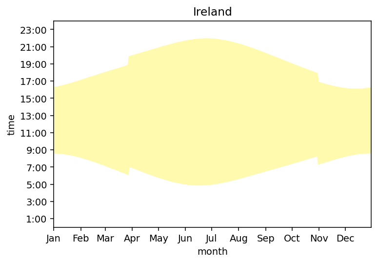
Here's Dublin, Ireland.

Irish people speak with reverence of the "grand stretch in the evening" during summer months. That's because we have long sunny evenings, which last until 9 or 10 o'clock in July. You can also see the sudden jumps caused by daylight savings ("spring forward, fall back"), and why that might be desirable. At the end of March, the little sunlight we have is being squandered during the early morning when everyone is still in bed. A clock shift avoids that.
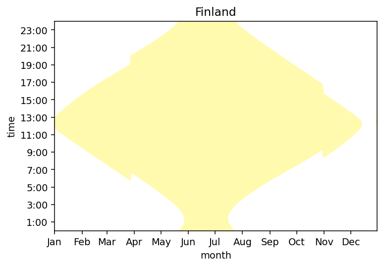
In Kittilä, Finland, things are even more extreme. So extreme that it exposed several bugs in my plotting code.

They experience something called "midnight sun" during the summer, where the sun is visible 24/7. And "polar night" during the winter, where it's dark 24/7. Such is the fate of those who dwell near the north pole.
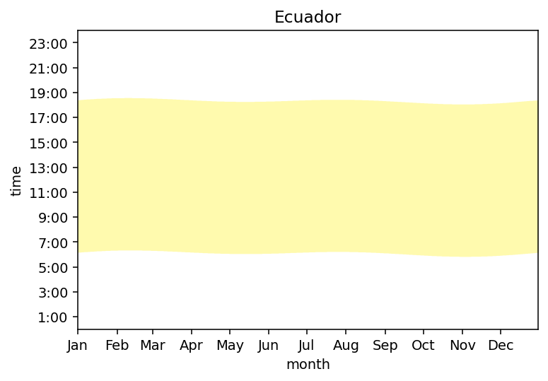
Then you have boring, plain-Jane Quito in Ecuador1. Daylight hours don't change much in Quito because it's near the equator. Truly no match for the grand stretch in Ireland.

The beautiful, industrial-strength code behind these powerful and insightful graphs can be found at https://github.com/Kevinpgalligan/daylight-plots. There is no irony in the previous sentence. I pulled the sunrise and sunset data from https://dateandtime.info/.
I know nothing about Quito and I'm sure it's a lovely place. ↩
I'd be happy to hear from you at galligankevinp@gmail.com.