As you may have heard, we're in the middle of a crisis.
No, not that one. I'm talking about the website obesity crisis.
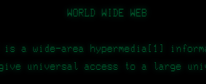
The homepage of the first ever website, published by Tim Berners-Lee in 1991, was 2.2KB in size. It was a sparse list of links. Pure, aerodynamic HTML. The internet users of the time would have viewed it through black-screened terminals with green text.

Our expectations of the World Wide Web have grown since then, and so have websites. The median webpage size in 2020 is 2MB, and it has been increasing at a rate of about 165KB per year for the past 10 years1. It is now 800 times larger than Tim's original homepage.
In what follows, we'll explore the cause of this newfound corpulence, its repercussions, and my own struggles with website weight as I attempted to create a metronome web app in less than 1KB.
Why is the web so much heavier, these days? That's one of the questions that the HTTP Archive attempts to answer. It's a community-run initiative to capture the state of the web over time. They catalogue millions of websites every month and publish the results as a database.
After removing the smallest 10% and largest 10% of webpages from the HTTP Archive database for April 2020, we see that images account for almost 60% of the collective mass of the web. A further 25% is taken up by JavaScript, 6% by custom fonts, 5% by CSS, and 3% by video, until finally, a mere 2% of the pie is left for HTML.
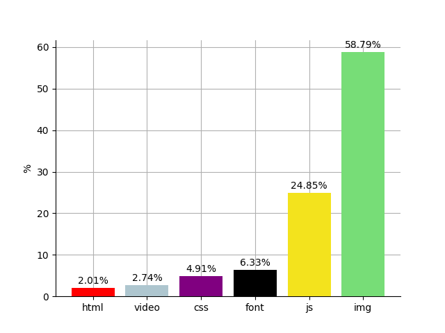
Most websites don't have this exact breakdown of weight, but it's roughly what you can expect to download when you spend a lot of time on the web, depending on which sites you visit.
The "average" 2MB webpage, then -- which, in fact, doesn't exist, but is useful to think about -- comes with 1.2MB of image data (60% of 2MB). That's rather a lot of eyeball stimulation. The below portrait of William Howard Taft, the most voluminous ever president of the United States and the basis of the Taft Test, uses up just 2% of a 1.2MB budget. We can only assume either that modern websites include a lot of Taft-sized images, or that their images are absurdly heavy.

And let's be honest with ourselves: most images on the internet have less utility and aesthetic value than Taft. If you've ever read a Medium article about a technical subject, headed by a high-resolution photograph of a windmill, then you know what I'm talking about.
More offensive still, the "average" webpage is now bundled with 500KB of JavaScript. If you wrote 200 lines of code per day at 80 characters per line, it would take a whole month to write a 500KB program. This is surprising to me, considering that the average website is less interactive than a tree stump. You could fit 15 copies of the original Super Mario Bros into 500KB. Yet, rather than a delightful platforming adventure worth hours of fun, we are instead subjected to ads, tracking scripts, and mountains of garbage pulled in from the JavaScript ecosystem.
To summarise our survey of the modern web: it's fat. Unhealthily so.
While some of us live in parts of the world with affordable, fast internet, others are not so fortunate. As of May 2020, the download of a 2MB webpage in Mauritania is worth approximately 6 minutes of labour. More specifically, whatdoesmysitecost.com estimates that the download would cost 1.29% of Mauritania's daily gross national income per capita, and 1.29% of an 8-hour workday is ~6 minutes.
Obviously, there are more pressing issues in Mauritania than fat websites, but it pays to consider that by playing fast and loose with the weight of your website, you may be making it inaccessible to large numbers of people. This post by an ex-YouTube engineer explains how a lightweight version of YouTube's video player made the site accessible to users in remote regions of Siberia.
The overweight web also has an environmental impact. The internet as a whole consumes more electricity than the entire United Kingdom2. So, if you're the sort of person who gets excited about recycling, then you should also consider shedding some of that dead weight from your website.
Recently, with this glum state of affairs at the back of my mind, I found myself in need of a metronome web app. A metronome, if you didn't know, is a tool that ticks at regular intervals.
I didn't like any of the apps I found. They were grotesquely overweight (as large as 11.35MB), mobile-unfriendly (I can't express the horror of trying to set precise numeric values with a slider), and full of trackers (hi Google!).
As a result, I set myself a challenge: to make my own, mobile-friendly, slider-free metronome app, with the constraint that it be less than 1KB in size. That's half the size of Tim Berners-Lee's original webpage. A tight margin, for sure, but this would be small fry compared to the 1KB JavaScript games that some people make for fun.
The finished product is here. The first version was over 2.5KB, but by applying various dirty tricks (detailed in Appendix B, along with technical details of the app), I managed to shrink it down to 981 bytes, or ~3.5 tweets.
<!DOCTYPE html><title>Metronome</title><meta name=viewport content=width=device-width>
<style>body{display:grid;grid-template-columns:50%50%;max-width:150px}
#b,button{text-align:center;line-height:50px}</style><script>p=!1,b=100,i=.025,
l=.1,n=0,M=Math,D=document,x=new AudioContext,H=((e,n)=>e.innerHTML=n),
h=((e,n)=>H(D.getElementById(e),n)),s=(()=>{for(;n<x.currentTime+l;)o=x.createOscillator(),
v=x.createGain(),o.connect(v),v.connect(x.destination),o.frequency.value=200,o.start(n),
o.stop(n+.1),G=v.gain,G.setValueAtTime(.01,0),G.exponentialRampToValueAtTime(1,n,n+.05),
G.linearRampToValueAtTime(0,n+.1),n+=60/b}),r=(()=>p&&(s(),setTimeout(r,i))),
c=(()=>{p=!p,p?(h("c","stop"),n=x.currentTime,r()):h("c","play")}),
a=(e=>h("b",b=M.min(M.max(20,b+e),240))),window.onload=(()=>[-1,1,-5,5,-25,25].forEach(
n=>(e=D.createElement("button"),e.addEventListener("click",()=>a(n)),H(e,(n<0?"":"+")+n),
D.body.appendChild(e))));</script><p id=b>100</p><button id=c onclick=c();>play</button>
The purpose of this exercise? Mostly as a point of comparison for other online metronome apps, which I believe are symptomatic of the horrid state of the web, and which we will examine in the next section.
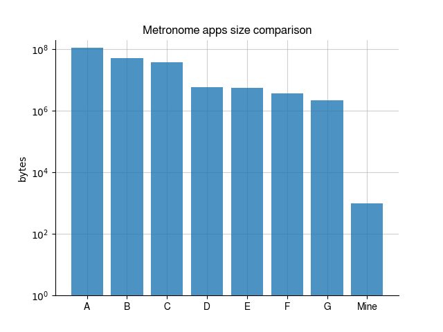
Here's a size comparison of my metronome versus the top 7 metronomes, labelled A-G, that come up when you search "metronome online" with Generic Search Engine. The y-axis is on a logarithmic scale, which means that it counts from 1 to 10 to 100, instead of 1 to 2 to 3. Otherwise, some of the bars would be microscopically tiny. Metronome A is 11.35MB (around 108 bytes), metronome G is 217.56KB (106), and my metronome is 981 bytes (103).
Yes, folks, you heard it here first: mine is smaller. To get a sense of how much smaller, consider this depiction of Earth and Jupiter (source).
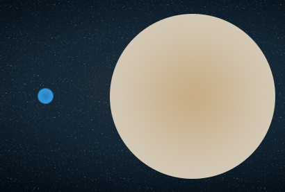
Quoting universetoday.com3:
The largest planet in our Solar System, Jupiter’s size is astounding. Jupiter has a volume of 1.43 x 10¹⁵ cubic kilometers. To show what this number means, you could fit 1321 Earths inside of Jupiter. It is hard to imagine how large that actually is.
If my metronome app were Earth, then Metronome A would have the volume of eight Jupiters. As the article says, it is hard to imagine how large that actually is.
Keep in mind that none of the larger metronomes offer any features besides ticking. Admittedly, they're much prettier, but my point is that the weight of these web apps is massively disproportionate to the functionality that they offer. And the same can be said for much of the modern web.
I'm not suggesting that we become leather-clad monks, purging strips of fat from our websites with puritan fury. While fun, compressing a website takes a lot of effort, and the end result tends to look like shit. Let's just try to keep our websites Earth-sized, please. Or even Neptune-sized. Not everyone can afford to download Jupiter.
After loading the HTTP Archive database into Google BigQuery (it's free and takes 5 minutes, instructions here), I ran this query to fetch the data I needed for my bar chart.
SELECT
  SUM(bytesHtml) as html,
  SUM(bytesJS) as js,
  SUM(bytesCSS) as css,
  SUM(bytesImg) as img,
  SUM(bytesFont) as font,
  SUM(bytesVideo) as video,
  SUM(bytesTotal) as total,
  COUNT(*) as count
FROM
  `httparchive.summary_pages.2020_04_01_desktop`
WHERE
  bytesTotal >= 456601 AND bytesTotal <= 7363789
The bounds on bytesTotal are the p10 and p90 values of page size, plucked from here. They're intended to remove outliers. The bar heights are then bytes/total*100.
Results:
html 188774196140
js 2337263808937
css 462249675219
img 5528893867126
font 595097490698
video 257342218994
total 9405167424348
count 3728058
You might complain that this distribution is skewed, even after we've removed outliers. Some websites may have super heavy images, but most websites don't. In response to that quibble, here's another query we can run. It shows the number of webpages that load images.
SELECT
  COUNT(*) as count
FROM
  `httparchive.summary_pages.2020_04_01_desktop`
WHERE
  bytesImg > 0
The answer turns out to be 4,658,956. There are ~4,660,072 webpages in the database, meaning that more than 99.9% of webpages have image data. And, according to the reports of the HTTP Archive, the median image weight of webpages is 950KB, or thereabouts. This means that 50% of webpages have 950KB or more of image data, and our figure of 1.2MB isn't far off the mark, skewed though it may be.
Here I'll describe how the metronome web app works, and also the series of gruesome hacks I employed to shrink it below 1KB.
Humans are highly sensitive to audio delay, so it's important for a metronome app to tick as reliably as a Swiss clock. If you play audio directly in the main thread, which is what I tried before finding enlightenment, then you're going to suffer from unacceptable delays in sound whenever you lose control to the browser's UI and book-keeping functions.
Instead, when you start the metronome, it kicks off a scheduling function in the main thread that runs every 25 milliseconds. The scheduling function calls JavaScript's WebAudio interface to schedule any beeps that are due to play in the next 100 milliseconds. WebAudio plays the beeps in a separate thread. Even if the scheduling function is delayed by 50ms or so, there's enough of a buffer that the next beep can still be scheduled on time.
Apparently, this technique can also be applied to animation, making it useful for game development.
As for making the app smaller, here are some of the things I tried:
<p id=x> the same as <p id="x">; and 2) if you omit <html>, <head> and <body> tags, they'll be generated for you by the browser.false with !1.I'd be happy to hear from you at galligankevinp@gmail.com.